Branding for Sundownr
Sundownr is a camping technology brand who are creating products that enable socialization and connection in the great outdoors.
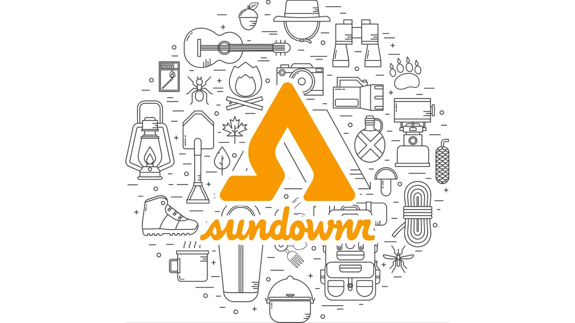
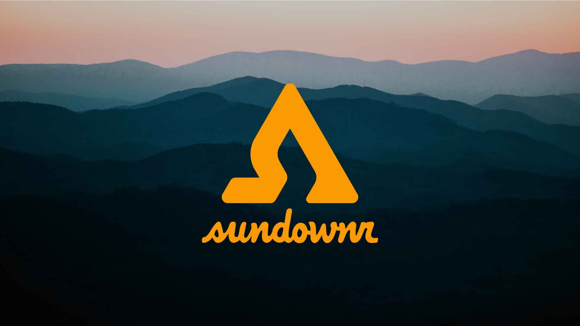
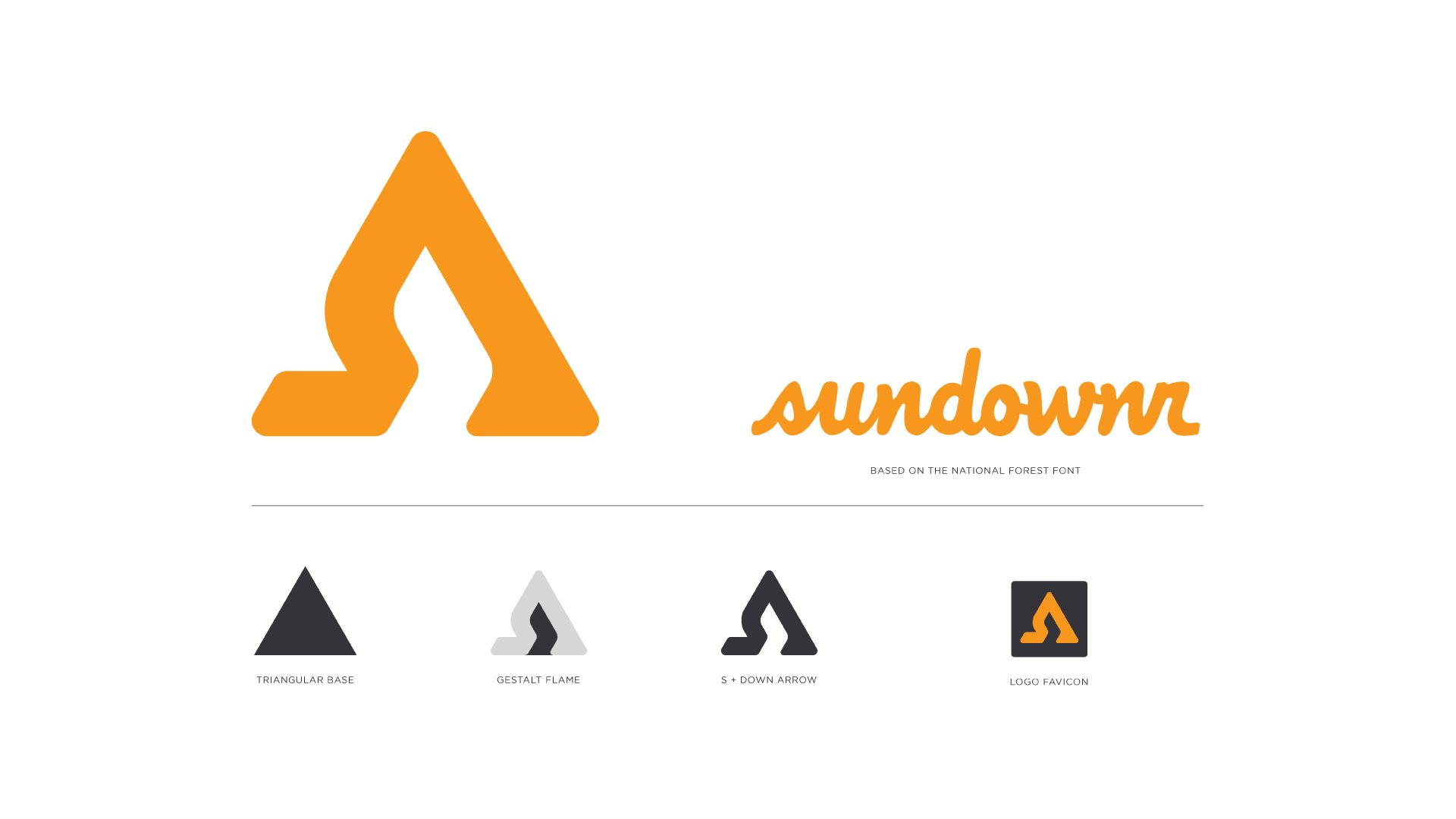
The Sundownr logo
The Sundownr logo was created as a visual extension of their flagship product. The Sundownr, is a small canopied tent with a flickering light inside that simulates a fire, for those nights when a real fire is not allowed.
The base of the logo is comprised of a triangle, a long know symbol of fire. In the negative space of the triangle can be seen an abstract representation of flame. The outline of the logo is represented by an S shape and a gestalt downward pointing arrow.
The Sundownr wordmark is a custom built mark based on the national forest font. It embodies the fun but rugged outdoor nature of the Sundownr brand.
Color palette
The Sundownr palette is bold, distinct, and sophisticated, based on the iconic sunsets of the Rocky Mountains.
The primary colors of vibrant orange and cool dark grey set the tone of a warm fire at dusk.
The secondary palette consisting of off-white, perfect for setting type on dark backgrounds, and red, green, and blue allow for a pop of color when attention is needed.

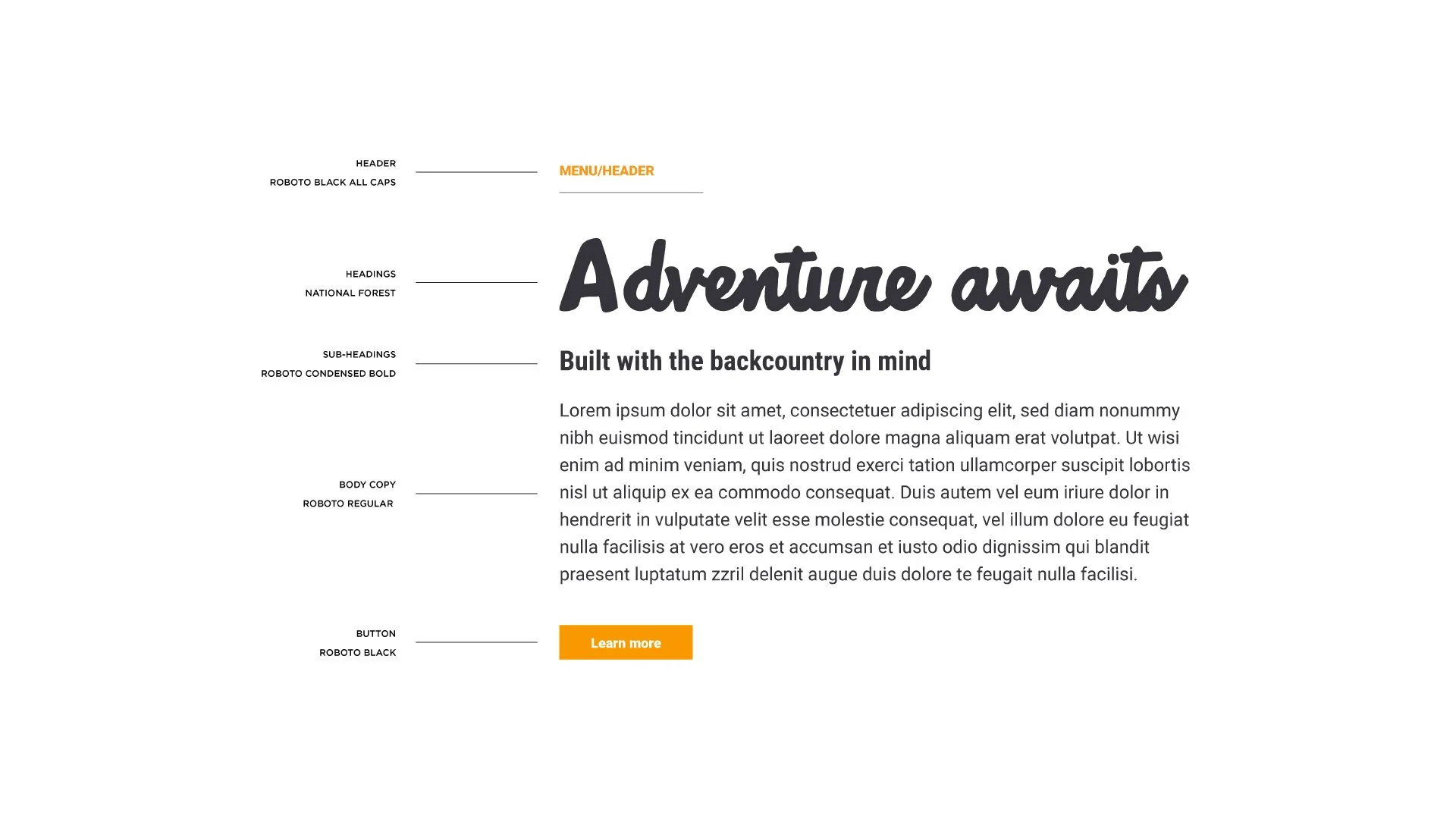
Typography
Sundownr relies on three fonts, National Forest, which is the base of the sundownr wordmark, Roboto condensed, and Roboto
a neo-grotesque sans-serif typeface
The font pairings create a uniquely ownable experience with legibility being the main focus of the Sundownr typography.
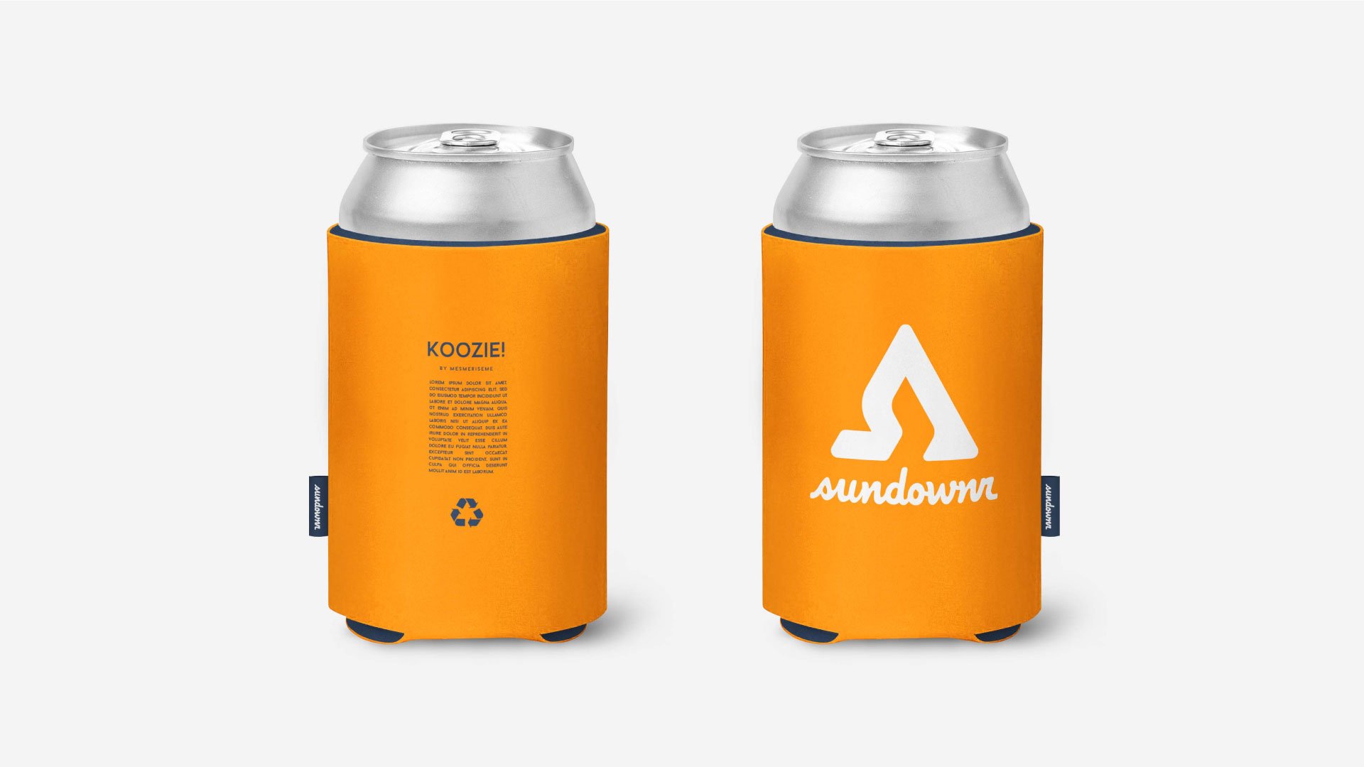
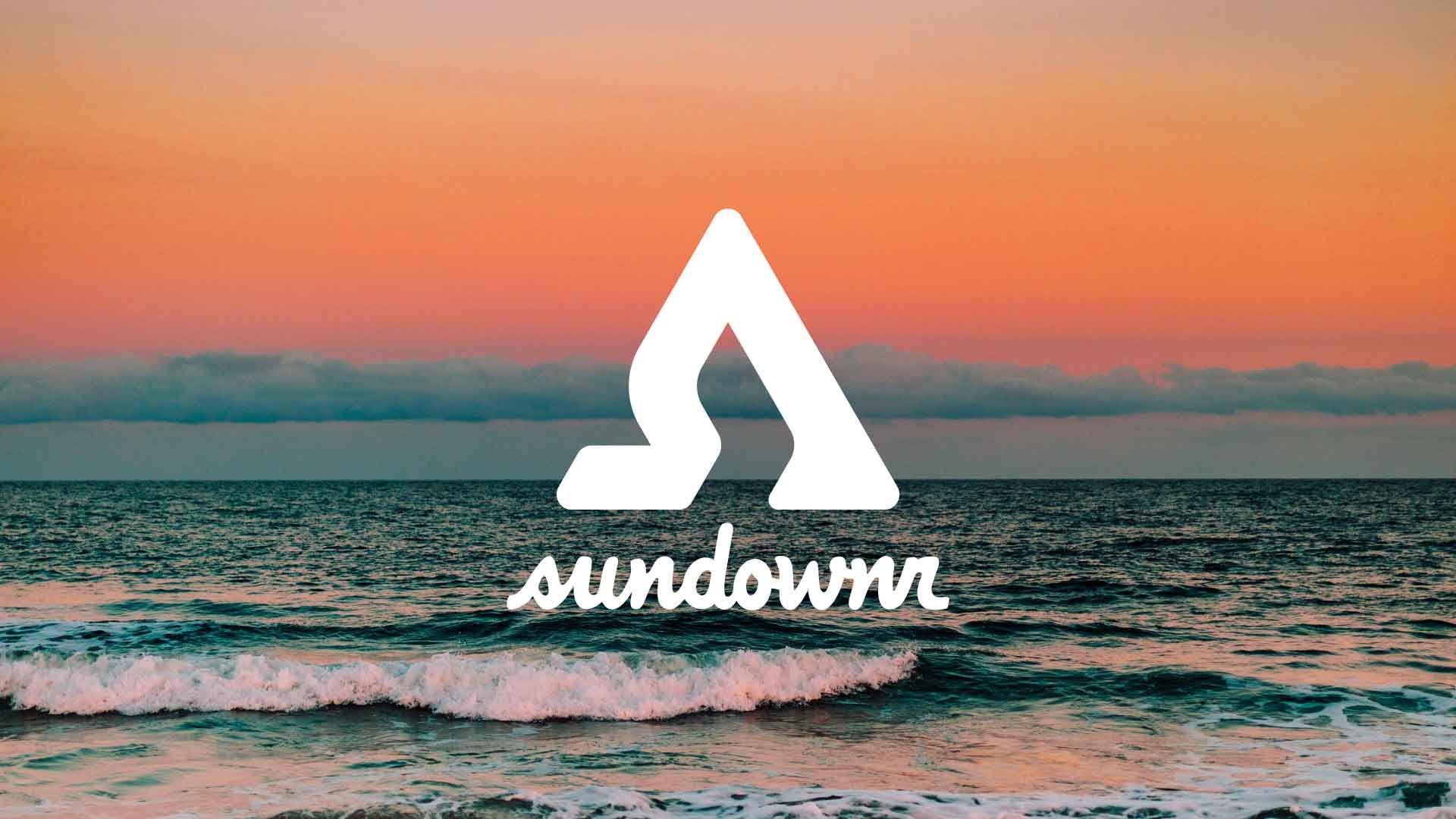
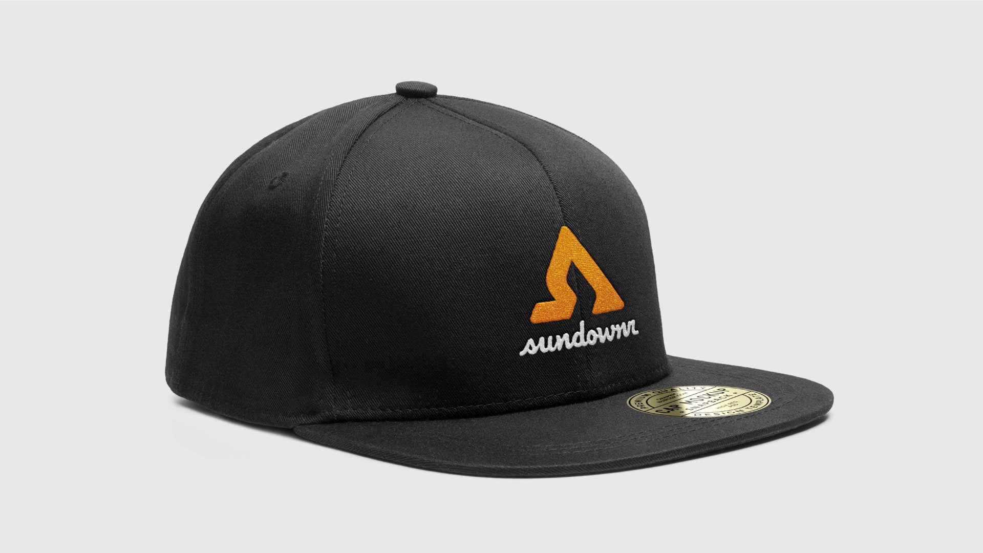
Brand in application