Branding for Arturo.ai
The Arturo brand provided me with a unique set of challenges. I approached this project as an opportunity to tell a story, one of history, strength, intelligence, and excitement.
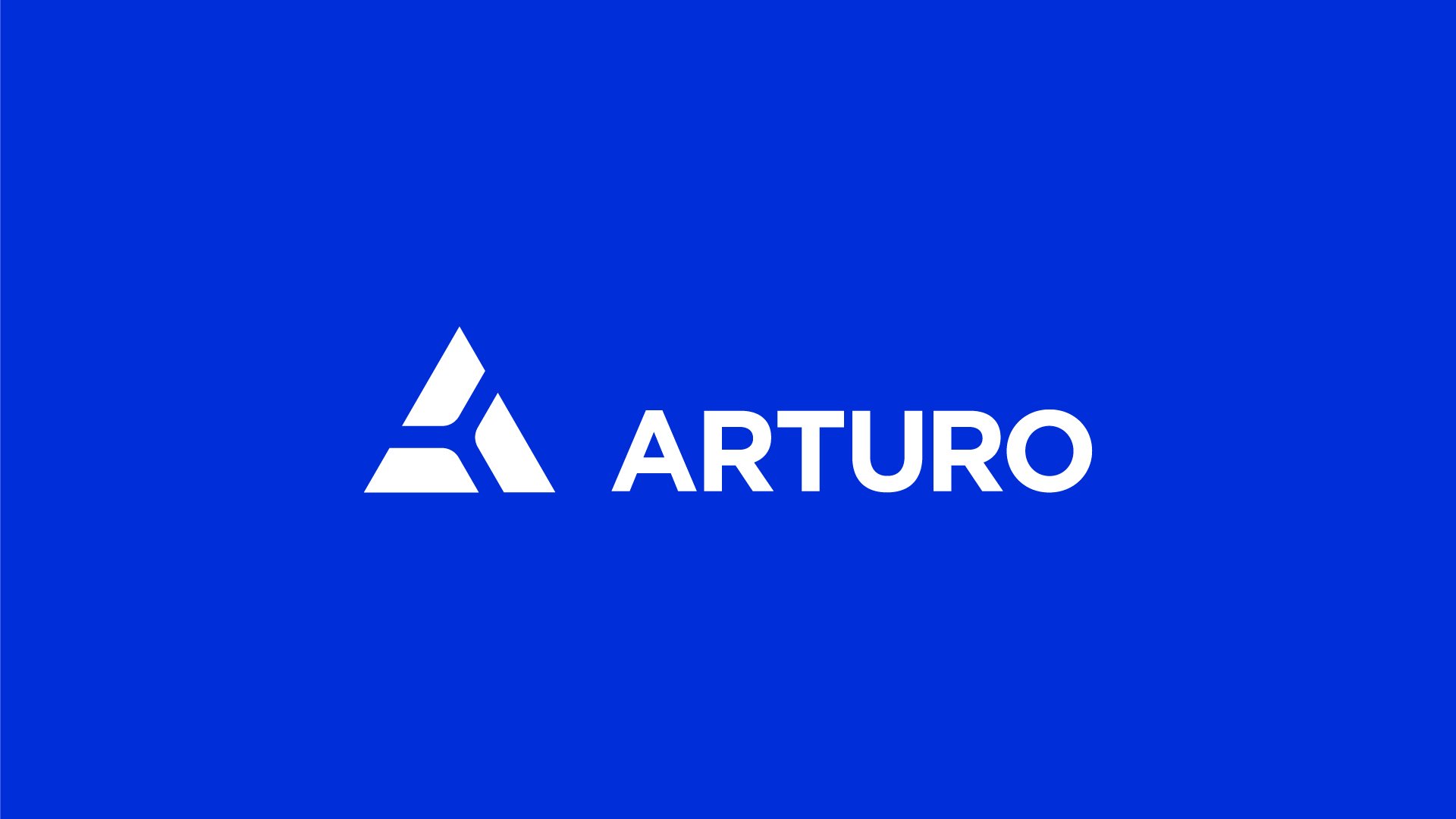
The Arturo logo
The Arturto logo represents strength, history, and intelligence.
The Triangular base represents a foundation of strength and is a reduced simplification of the letter A.
Each segment of the Arturo logo is a reduced representation of a crown. Derived from the three crowns which make up the crest of King Arthur.
The negative space of the logo is a gestalt cross section of a voxel, which is a well know visual representation of artificial intelligence and machine learning models
Color palette
The Arturo color palette is modern and yet timeless in its approach.
The primary palette consist of international klein blue and a dark navy offset, which provides an engaging and approachable color combination for both screen and printed applications.
The secondary palette is bold and provides a neccessary distinction to the visual langauge of a modern technology company.
The primary color of Arturo, International Klein Blue (IKB), is unique because it maintains as much of its intensity of color as possible. IKB was chosen as the primary because it is a strong blue that stimulates clear thought.

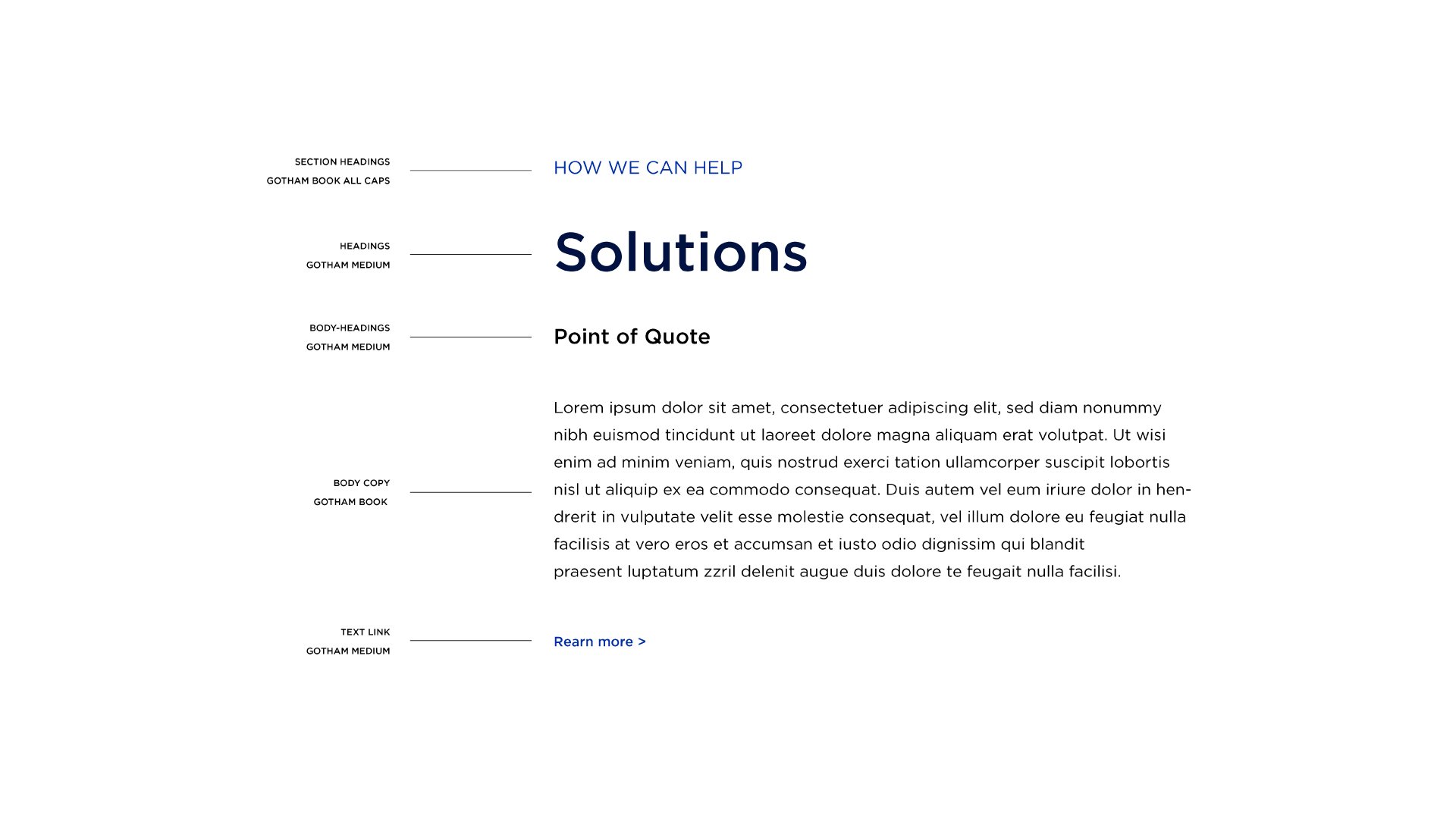
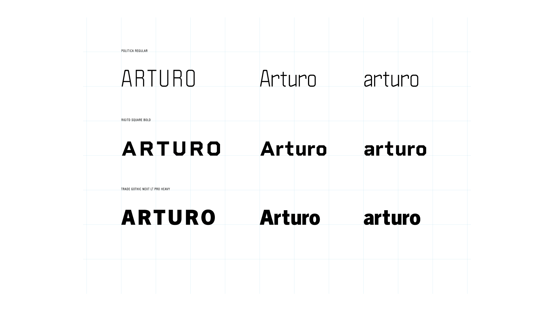
Typography
The orignal Arturo brand relied on a singular typeface to convey a strong voice incorporated into the core of the visual identity. The font chosen was Gotham a geometric sans-serif typeface family designed by American type designer Tobias Frere-Jones with Jesse Ragan and released through the Hoefler & Frere-Jones foundry from 2000. Gotham's letterforms were inspired by examples of architectural signs of the mid-twentieth century.
Research
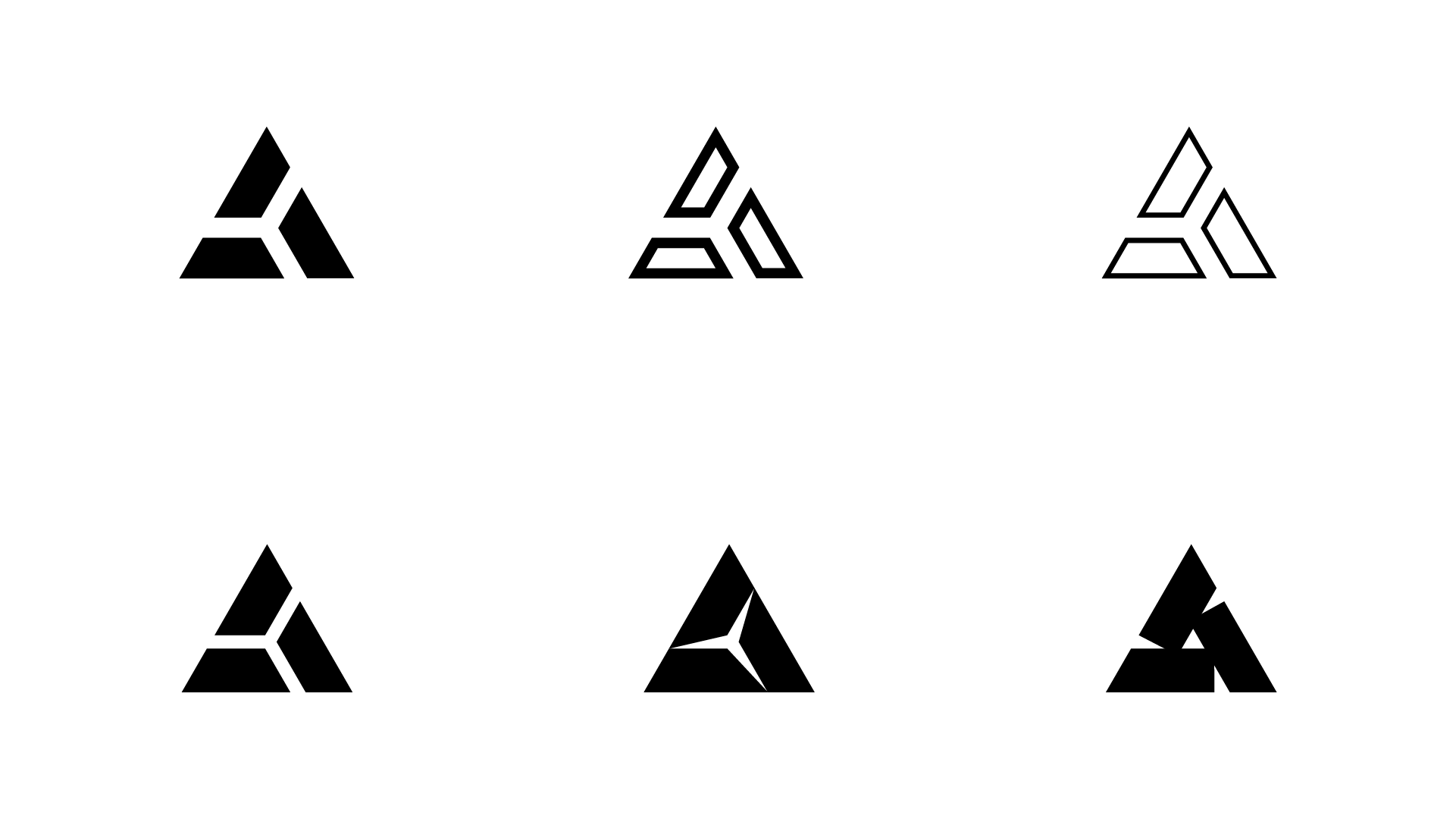
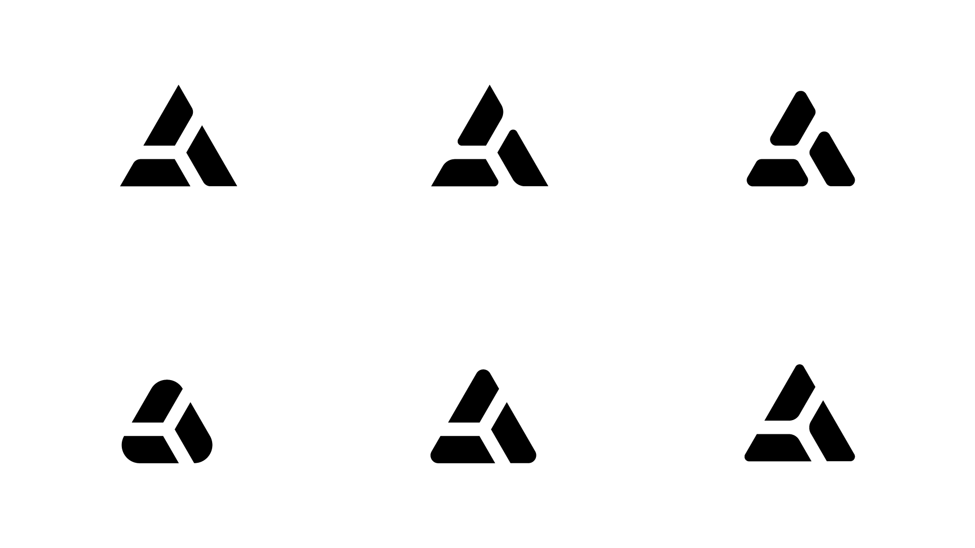
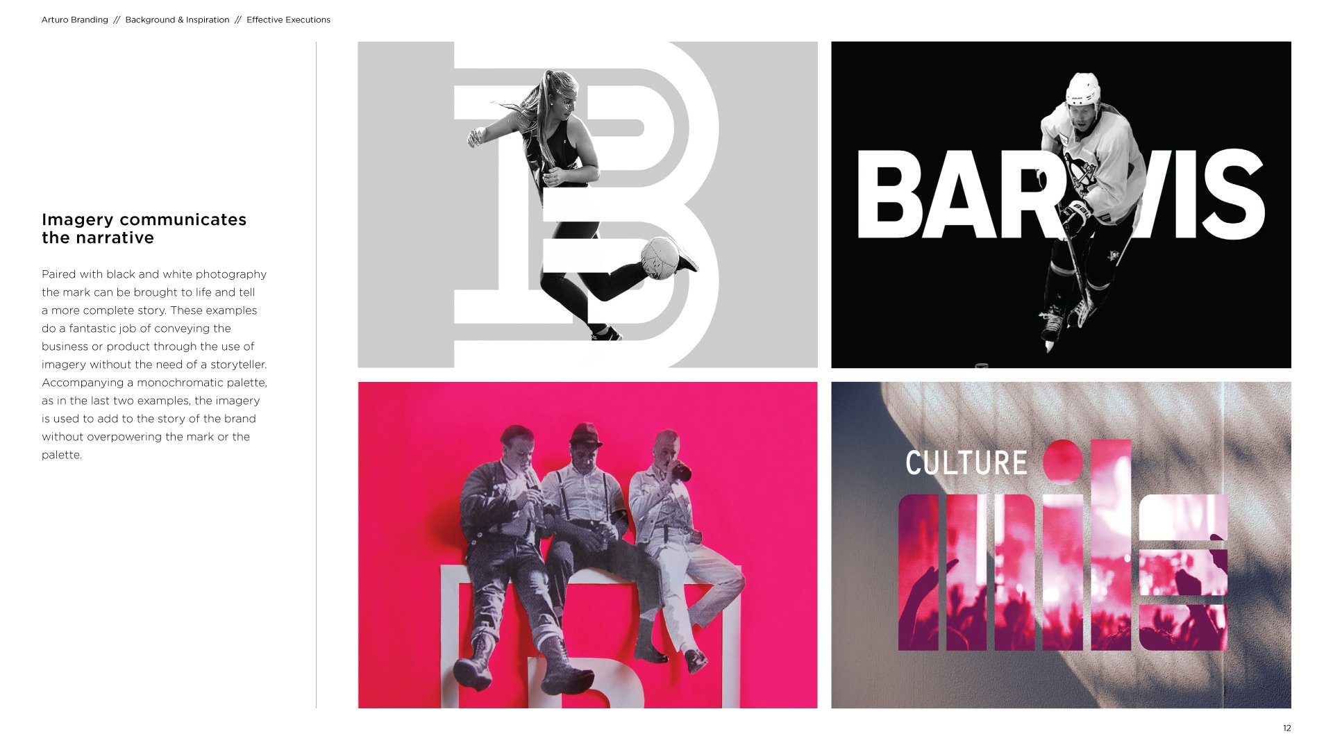
The following examples display a small cross section of the research done while creating the Arturo visual identity.


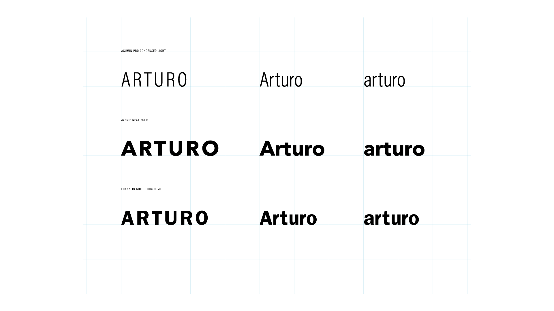
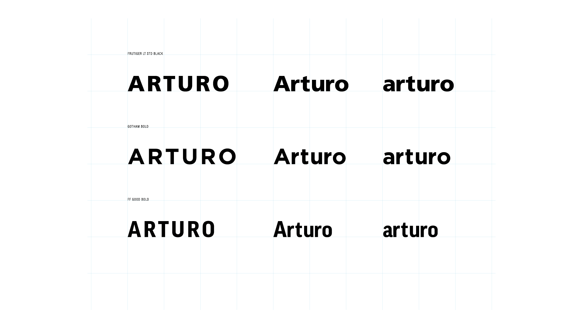
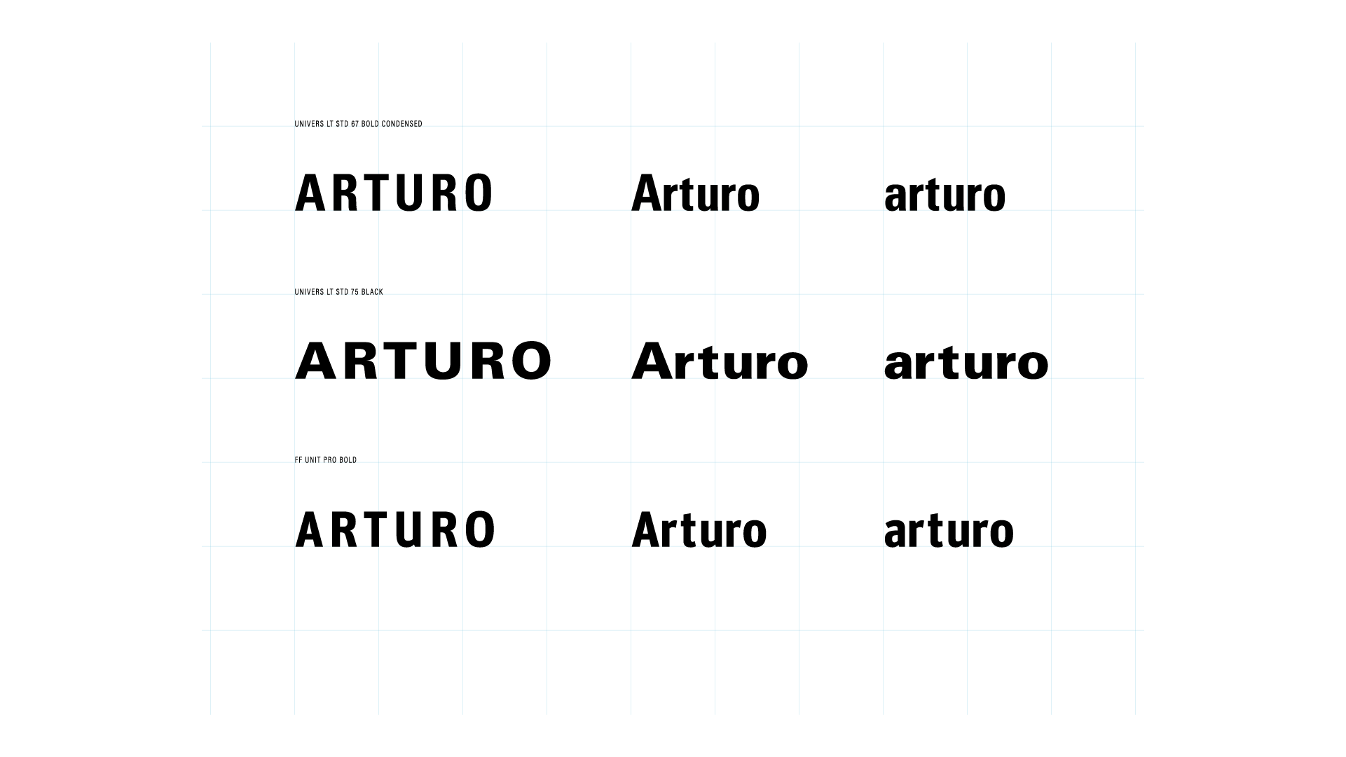
Logotype exploration

Logo exploration